Deliveroo is a technology company focused on marketing, selling and delivering high-end restaurant meals to the household or office.
The company’s latest funding round values it at $1 billion, according to the FT, and to date it has raised $400 million, making it one of the best funded startups in Europe.
– Brand identity – Art direction – Rider resources – Animation
Process
I joined Deliveroo in July 2015, my role was to improve brand experience and help company scale in new locations. It was definitely one of the busiest and most exciting times of my career. Deliveroo was growing at incredible scale and launching new cities every month. The demand for marketing assets, partnership projects and website improvements was incredibly high. We quickly realised that we need to take Deliveroo design to the next level. With old brand look we were running into massive inconsistency issues. We didn’t have a solid system in place and we weren't fully happy with how we communicated core branding proposition. We wanted to express our love for food. Let’s face it, old kangaroo logo also needed a refresh.
While we kept working on existing product we started the process of brand-refresh. We were a fairly small team at the time and when we scoped the scale of this monster-project we agreed that we will need some help from people who already had experience working on equally big brand redesigns. We were facing a challenge of redesigning all of the existing material for customers, drivers and corporates for all twelve countries and in many more languages. We sent the word out and started speaking to agencies. They were all kind of creative teams, big and small. One pitch though, made us feel much more confident about the challenge ahead of us.
We met Design Studio - London based agency who worked on fabulous Airbnb rebrand. They were speaking in our language, we knew that these are the right guys to work with and were confident to hand our “baby” in their hands. We knew right from the beginning that this will be a long process. We had to nail research, brand positioning, art direction, photography, new visual system and many more. Main challenge was to do all of that, while keep working on existing brand and make sure our engagement doesn’t drop off.
We worked closely with Design Studio over the period of six months. We explored a variety of routes for a new logo – some that kept the kangaroo as its primary inspiration, to completely new logos that left our kangaroo roots behind. What the process highlighted was that both internally and externally our Roo had become a beloved part of our brand.
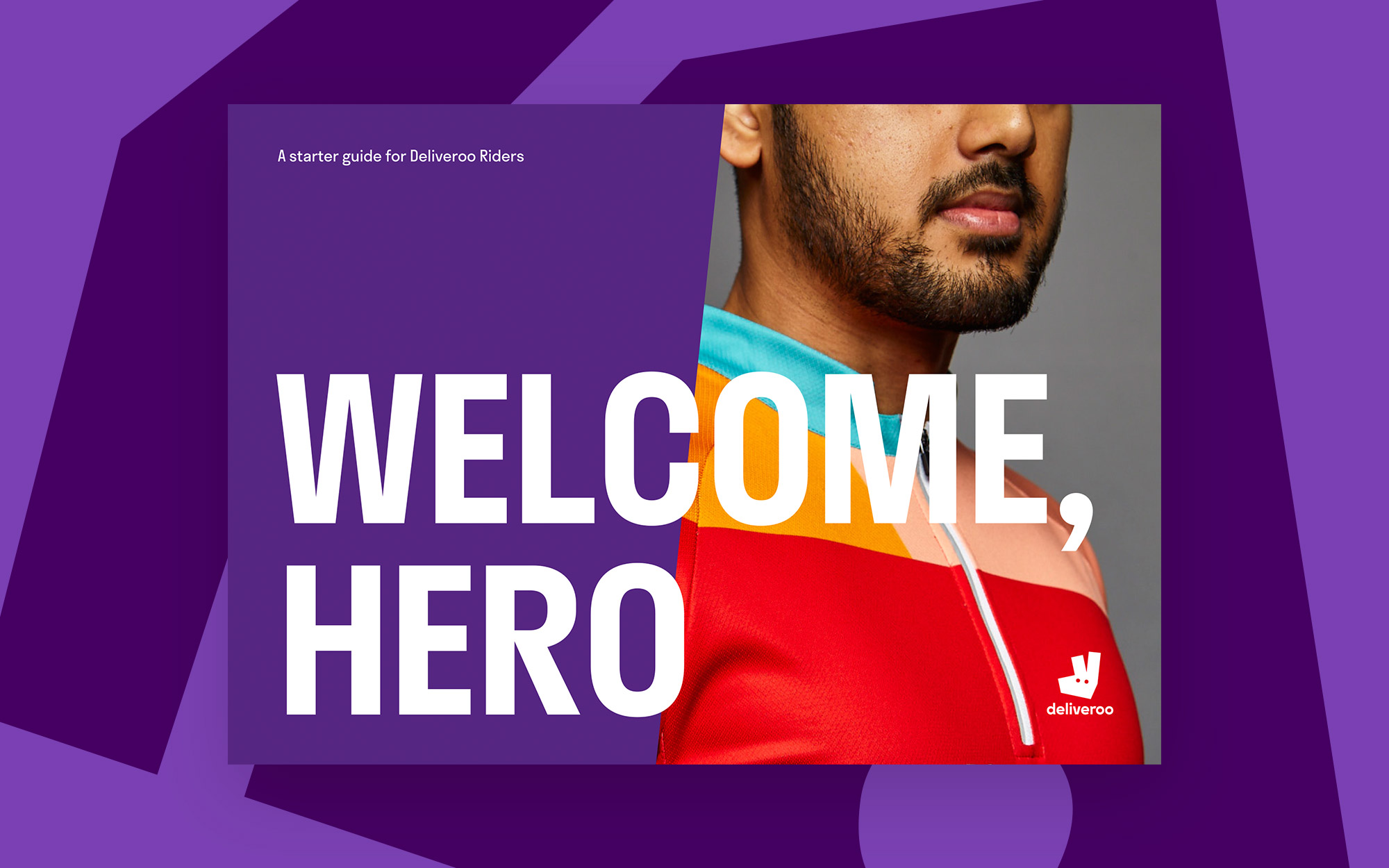
What we landed on was an evolution from our original and more literal take on the kangaroo, turning it into a striking new mark bold and impactful, but still maintaining the character and charm of the Roo. Importantly, this new Roo gave us a series of angles that would help the rest of our graphic system take shape. A system that would run across everything, from our site to our rider kit.
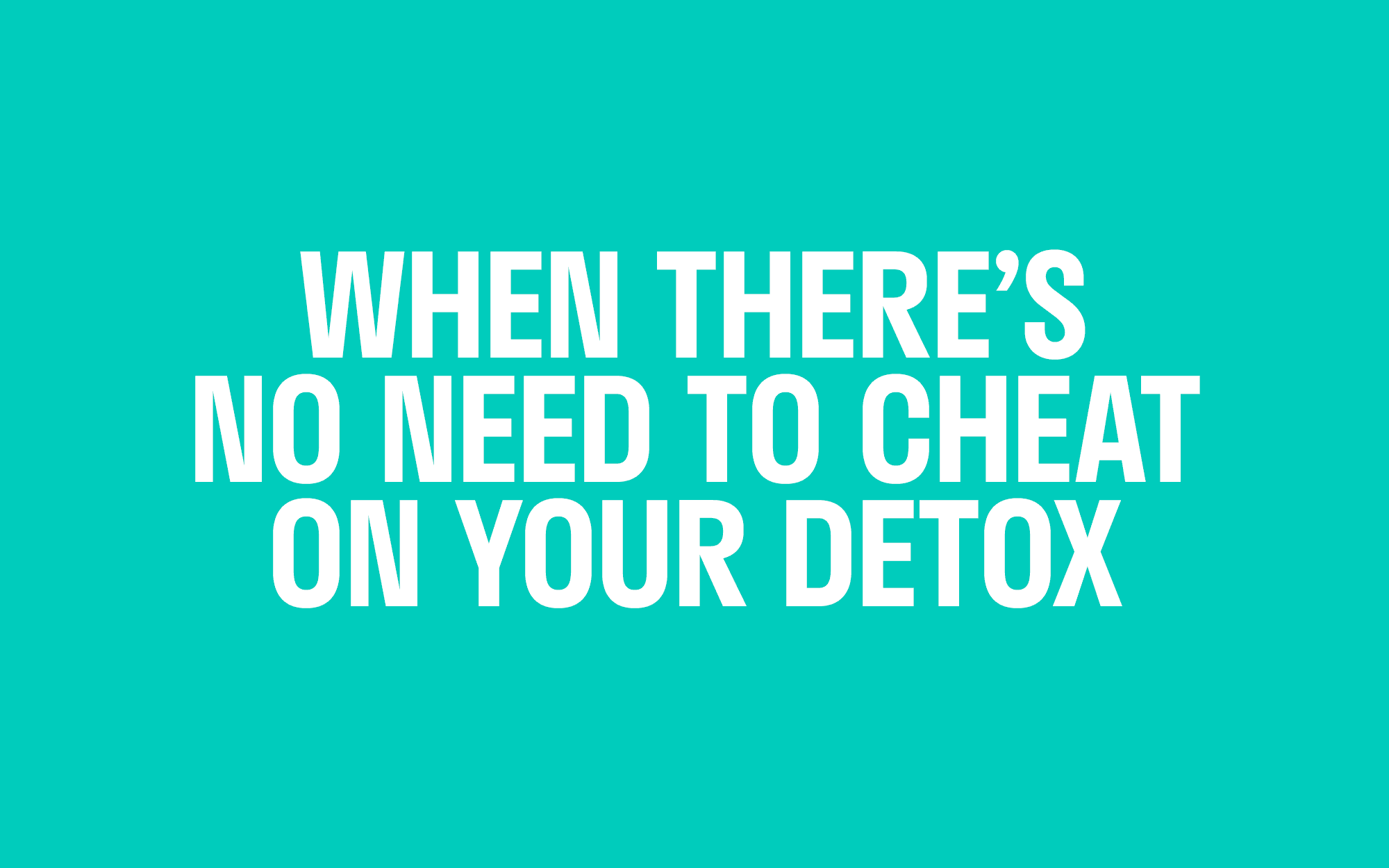
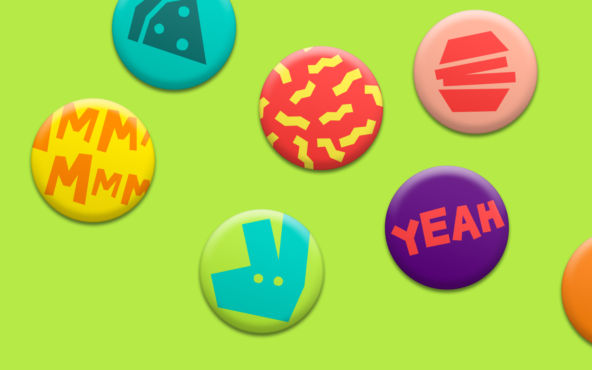
We developed brand system with vibrant colours, bold typography, intriguing angles and exciting photography. We used custom designed typeface - Stratos that works great for chunky headlines. Our palette grew from one to twelve colours, what gave us plenty of flexibility when working on driver apparel, posters and packaging. Copywriters came up with dozens of fun taglines to support detailed food photography. New graphic shapes can be used as blown up background patterns. Finally, we had a rock-solid design language system that could be applied to all elements. When we launched our new look, the energy of brand was all we wanted it to be. Ordering with Deliveroo started to feel way cooler. We received amazing feedback from hundreds customers and team members around the world. With new design system in place, Deliveroo is prepared to scale even bigger and stronger. Here’s to the awesome food.